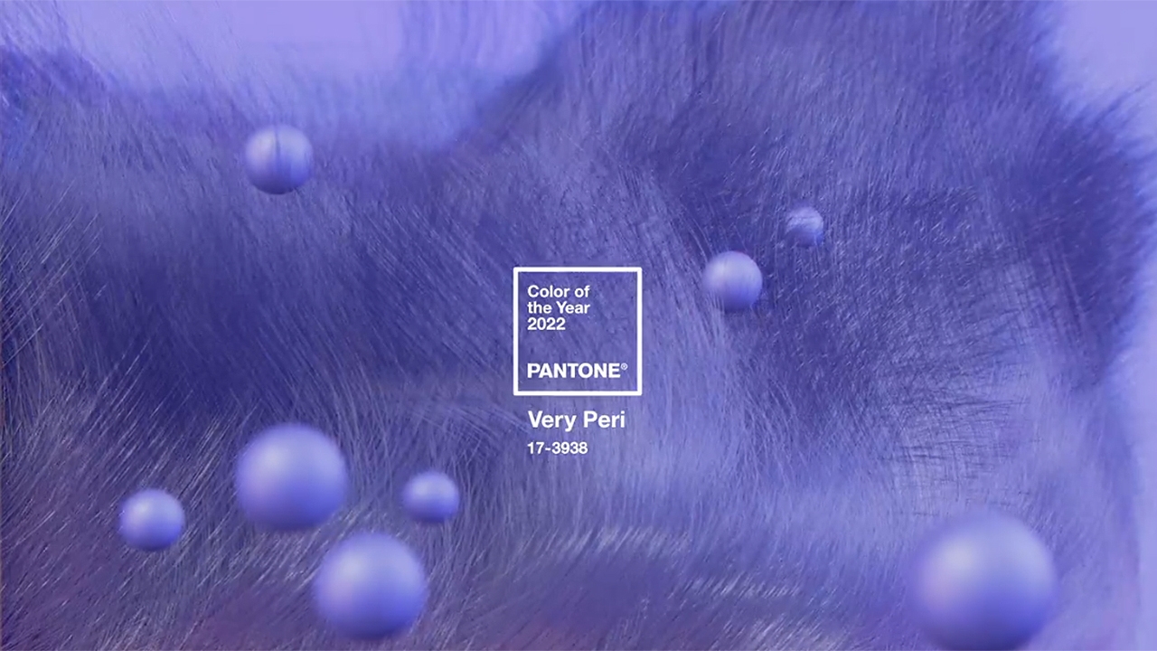
For 23 years, Pantone’s Color of the Year has influenced product development and purchasing decisions in multiple industries, including fashion, home furnishings, and industrial design, as well as product packaging and graphic design. The Pantone Color of the Year selection process requires thoughtful consideration and trend analysis. To arrive at the selection each year, Pantone’s color experts at the Pantone Color Institute™ comb the world looking for new color influences. Pantone recently announced the Color of the Year 2022 is PANTONE 17-3938 Very Peri, a vibrant periwinkle blue with violet red undertones.
“It was really important for us to come up with a new color, because we have a very new vision of the world now,” Pantone Color Institute executive director Leatrice Eiseman told CNN.
“A New Pantone Color Whose Courageous Presence Encourages Personal Inventiveness and Creativity.”
Encompassing the qualities of the blues, yet at the same time possessing a violet-red undertone, PANTONE 17-3938 Very Peri displays a spritely, joyous attitude and dynamic presence that encourages courageous creativity and imaginative expression.
“It’s unusual to refer to blue as ‘happy,’ but when you add that red element to it, that’s exactly what happened,” Eiseman added, speaking to Time. “We felt it was so important to put together a color that encapsulated the feeling of newness.”
Displaying a carefree confidence and a daring curiosity that animates our creative spirit, inquisitive and intriguing, Pantone describes Very Peri as, “Rekindling gratitude for some of the qualities that blue represents complemented by a new perspective that resonates today, PANTONE 17-3938 Very Peri places the future ahead in a new light.”
The color is the “happiest and warmest of all the blue hues,” blending the “faithfulness and constancy of blue with the energy and excitement of red” to deliver an “empowering mix of newness” with a “carefree confidence and a daring curiosity that animates our creative spirit,” said the company in its announcement.
Evocative of a new modernity, PANTONE 17-3938 Very Peri injects a sense of playful freshness into home interiors, enlivening a space through unusual color combinations. A versatile shade that animates our creative spirit, PANTONE 17-3938 Very Peri is suited to an array of different materials, textures, and finishes, providing a pop of color whether introduced through a painted wall, statement furniture or home décor, or acting as an intriguing and eye-catching accent in a pattern.
How do you bring this new hue into your NEMA San Francisco home?
- Pillows, area rugs, throw blankets, wall art, and other accessories offer a simple way to try out Pantone's color of the year without going all-in on new furniture.
- A beautiful Tiffany-style stained glass floor lamp can add a lovely retro glow to any room in the home without being overtly ostentatious.
- The kitchen is a great place to use accents like glassware, towels, wall clock or small appliances.
- Choose textiles in the periwinkle tone paired with taupe tones to add another layer of comfort to bedrooms.
PANTONE 17-3938 Very Peri blends the faithfulness and constancy of blue with the energy and excitement of red to introduce an empowering mix of newness to apparel, beauty, home furnishings, product design, and packaging.
Tag us on Instagram and show us how you have incorporated Very Peri into your NEMA spaces!
San Francisco Apartments Designed with You in Mind
Designed by Glenn Rescalvo, partner at Handel Architects, NEMA’s four linked apartment building towers range from 10 to 37 stories, painting a dynamic modern silhouette across the San Francisco skyline. Tech-savvy and design-driven, NEMA is a next generation luxury residential community at the forefront of San Francisco’s dynamic Mid-Market neighborhood renaissance. Find your San Francisco apartment at NEMA. Get social with us and follow our story on Facebook, Twitter, YouTube and Instagram. Use #liveNEMA to share with our team.